
Advancements in data visualization reporting tools are helping companies make sense of ever-increasing data volumes and complexity. The right tools help increase efficiency and make data visualization more approachable for all users. Improved application design has made it easier than ever for even novice users to communicate complex ideas with simple graphs.
The need for electric utilities and energy agencies to communicate complex ideas and concepts in simple visual graphs is no different than in other industries. However, utilities have specialized needs for reporting due to evolving legislation and regulations, growing interest in new distributed energy resource (DER) technologies and increasing data capture requirements. Communicating with stakeholders is most effective when using clear, concise, visual methods.
Unfortunately, many of our customers have lamented the inability to gain access to broader data visualization application packages at their organization—either the seats are limited to other roles at the company, or they don’t have the time and resources to ramp-up their skills to use those tools. To meet the ever-evolving needs of utilities, PowerClerk® includes a powerful data visualization feature called Dashboards.
Data visualization in PowerClerk
PowerClerk supports two methods for producing data visualizations:
- Export program data via PowerClerk Reports
- Create visuals within PowerClerk using Dashboards
Utilities use PowerClerk Reports to export data and generate visuals in a host of third-party tools. In contrast, PowerClerk Dashboards offer reporting and data visualization capabilities inside PowerClerk and are designed to make it easier than ever for program administrators to support program transparency.
The Dashboards feature is designed with the utility DER program manager in mind. Dashboards make day-to-day work more efficient by helping communicate key program elements in easy to create visual reports. With Dashboards, DER program managers can generate reports in PowerClerk using data in the tool, and then share their reports with other users. No export, programming or third-party tools are required.
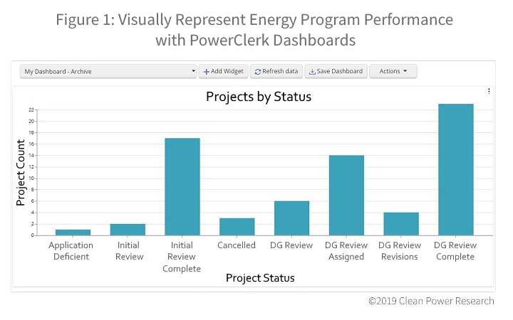
Track program performance
Dashboards provide a visual way to reflect the performance of an energy program. This means that executive, public utility commission (PUC) or other stakeholder questions about program performance can be easily answered with a compelling visual. Program administrators also can identify bottlenecks in processes to inform staffing requirements or help streamline workflows through better program design.
Simplify program communication with data visualization
Integrating Dashboards into the PowerClerk platform makes it possible to provide transparency to stakeholders with a click of a button. Where previously key program graphs might have been generated in external tools (such as Microsoft Excel, Power BI or Tableau), a simple “Refresh” click on the Dashboard generates an up-to-date graph in a matter of seconds. These graphs can then be shared with other roles through PowerClerk. As a result, program administrators can quickly respond to requests for progress reports or provide regular KPI scorecards.
Customize reports
Dashboards draw on data already captured in energy programs in PowerClerk, so each Dashboard can be customized to show specific statuses and data fields. Graph labels use the data field names that are familiar and relevant to program stakeholders. Filtering capabilities allow further customization so that administrators can control what information is shown to their audience.
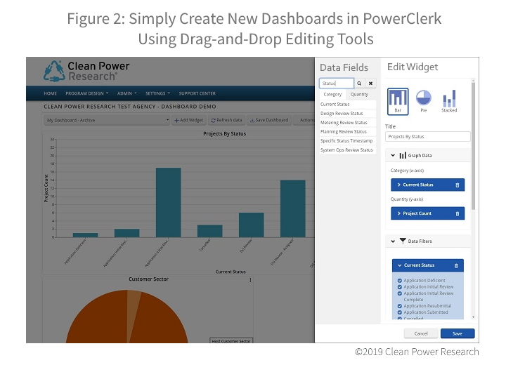
Straightforward dashboard creation
Dashboards were designed with our thousands of monthly users in mind—from administrators, to customer success representatives and utility engineers. So, creating a new Dashboard is straightforward. Simply create a new “widget,” then modify settings with the same drag-and-drop experience that supports PowerClerk’s form and workflow builders.
The need for electric utilities to communicate complex ideas and concepts in simple visual graphs is growing, driving increased demand for advanced reporting by DER program managers. PowerClerk Dashboards can help program administrators create customized, powerful data visualizations in minutes.
If you are a current PowerClerk customer, learn what Dashboards can do for you by contacting your sales executive today.
If you are new to PowerClerk, the utility industry’s leading DER workflow management solution, you can request a demo via our Contact Us page. Learn more about PowerClerk on our web site.