
While we all know that the energy production of solar PV systems can vary temporally on the short term (e.g., hourly and daily basis), monthly to annual variability can significantly affect the ongoing status of a developed PV solar asset. For developers and owners of solar, it’s important to be able to characterize PV variability to understand project risk, and enable more efficient operations and maintenance activities.
An example of this variability comes from the drought conditions that prevailed in 2013 and into the first half of 2014 in nearly all regions of California. During this time, prevailing clear skies allowed many locations in California to experience well above average PV energy generation potential. Beginning in July, however, enhanced North American Monsoon conditions dampened energy production through September.
To better understand just how the solar energy potential varied in California during 2014, we produced month-on-month variance maps of PV energy production referenced from long-term average conditions. The power variance maps, created using SolarAnywhere® Data and SolarAnywhere Typical Global Horizontal Irradiance (GHI) Year (TGY) data, are presented below:
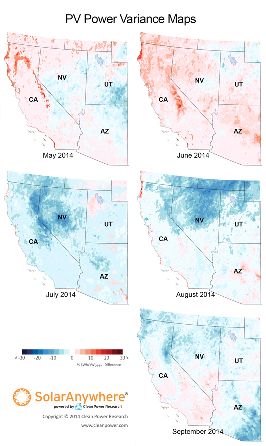
As can be seen by the prevalence of the color red (which indicates higher than typical energy production) on the May and June maps, most of California experienced above to well-above average potential generation during that time. This was due to a persistent offshore high pressure system that led to below average rainfall and cloud cover.
As a result, large portions of Northern California experienced above average PV generation potential, and coastal regions in both Northern and Southern California experienced well-above average potential generation due to weaker than average coastal marine stratus cloud coverage. Also, the southern leg of the Sierra Nevada Mountains exhibited above average PV energy potential due to drought conditions that limited the formation of mountain-induced cloud cover.
The abrupt change to blue colors (which indicate lower than typical energy production) on the July and August maps show how energy potential slipped to near or below average for most regions of California due to enhanced North American Monsoon-related cloudiness. Remnant moisture and cloudiness from an above average Eastern Pacific hurricane season helped enhance this year’s North American Monsoon season.
Finally, the September map shows PV energy production potential bouncing back in Southern California as monsoon-related cloud cover waned and shifted east over Arizona.
Why variability matters
The PV energy production variance figures shown above highlight anomalies in recent monthly energy production potential. Developers of utility-scale PV projects need to understand this variance, as it impacts ongoing project budget and debt management. For months with above or below average production, system owners need to know if that is due to higher or lower solar resource availability, or the result of a problem with their solar system, such as shading, soiling or poor-performing modules and/or inverters.
The SolarAnywhere Data historical and real-time dataset is available in both 10 km and 1 km resolutions, to help interested parties get the most accurate PV energy estimations possible, even in micro-climates.
Calculating PV production potential in your area
PV Power Maps are available for the previous three years, and are created from power production data generated using SolarAnywhere irradiance data and simulation services. The maps depict the amount of electricity that could have been generated by a nominal 1-kilowatt (kW) photovoltaic (PV) system on a monthly basis.
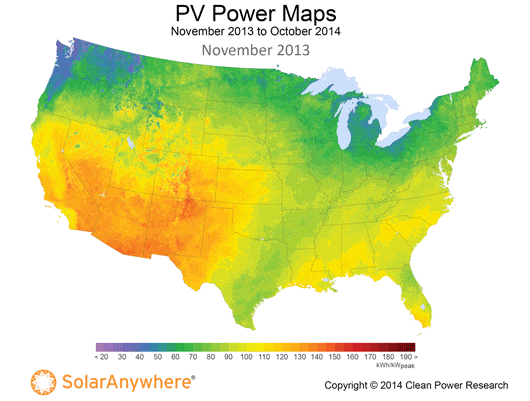
The PV Power Maps can be used to estimate what the output of a solar system might be in a particular area for any given month. Simply pinpoint a location on the map, refer to the color chart to determine that month’s PV power output, and multiply that number by the kW value of a PV system. You can learn more about the maps and how to use them in the article, “PV Power Maps: visualizing monthly production.”
PV Power Maps of the United States are also available at the Solar Today blog . Historical solar resource data is available for specific locations, free of charge, at www.solaranywhere.com.