
Not only was 2012 a record-shattering year for PV system growth in the U.S., it was also a good year for solar power production. Compare our monthly average maps for 2011 and 2012 to see that many locations in the U.S. experienced significantly higher PV energy production potential in 2012 than 2011 – particularly the Upper Midwest and Northeastern regions.
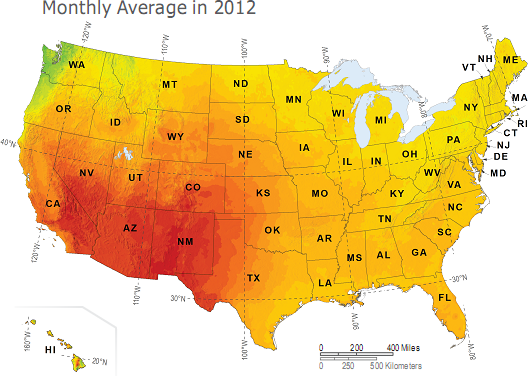
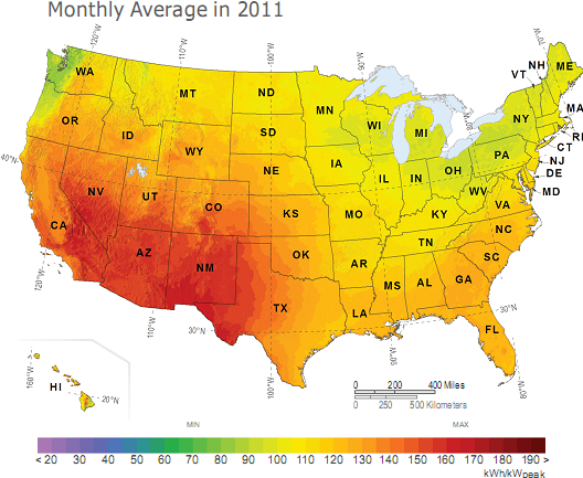
The ‘Monthly Average 2012’ map is featured in the April 2013 issue of Solar Today (see page 6), along with the December 2012 PV Power Map. The ‘Monthly Average 2011’ map was published in the April 2012 issue of Solar Today.
December is typically the lowest energy production month of the year due to lower sun angles and 2012 was no exception. In fact, as the map below shows, the northern half of the United States experienced below-average production due to an enhanced storm pattern. Meanwhile, the Central Valley of California was also impacted by seasonal cloud formations such as the Tule fog phenomenon . The following map shows the amount of electricity that could have been generated by a nominal 1-kilowatt (kW) photovoltaic (PV) system during that timeframe.
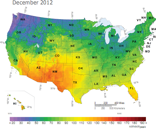
The Solar Today PV Power Maps are created from power production data generated by Clean Power Research using SolarAnywhere® irradiance data and simulation services, and rendered by GeoModel Solar . The maps depict the amount of electricity that could have been generated by a nominal 1-kilowatt (kW) photovoltaic (PV) system on a monthly basis. You can learn more about the maps and how to use them in the article, ‘PV Power Maps: visualizing monthly production.’