
With the proliferation of grid-connected solar—whether from a few large, utility-scale systems, or from thousands of small, behind-the-meter systems—utilities are grappling with integration of these distributed, variable power generation resources. Over the next three blog posts, we will share some methods and ideas related to modeling PV “fleets,”—the aggregate capacity of an arbitrary grouping of PV systems within a utility or ISO territory—and show how solar fleet modeling can be used by utilities to better integrate solar into their distribution systems.
Today, in Part 1 of our series, we will describe how to account for distributed PV fleets that have a variety of design configurations within a large geographical territory. This information can be used by utility planners to maintain grid reliability over the long-term by helping to anticipate future changes in the utility’s load shape, the new types of resources that will be required, and the changes to power flow on transmission and distribution circuits.
In future posts, we will consider high frequency data (temporal resolutions down to 60 seconds), and how this high frequency data can be used to evaluate the economics of regulation capacity (the cost of regulating PV variability).
Why PV output profiles vary
Planners require accurate, defensible solar profiles that represent the expected production from a large and diverse set of solar generators. Solar resources differ from gas, coal, and other resources because they are not dispatched, but instead have generation patterns based on available irradiance at their location and as-built system attributes (tilt, azimuth, shading, etc.).
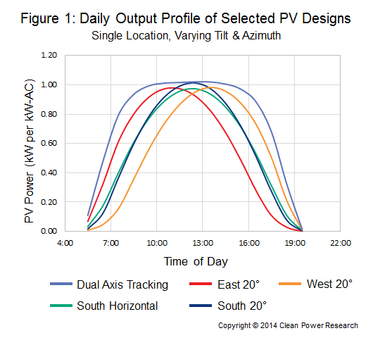
Figure 1, below, illustrates the challenge of deriving solar profiles for use in utility planning studies. This chart represents daily output profiles for five fixed PV systems at a single location. Each PV system uses identical hardware, but differs in tilt and azimuth angles, resulting in unique solar profiles. Planners must ask themselves, “Which curve should I use? Or should they all be combined into a single curve? And if so, how should they be combined?”
Blend of PV design configurations
Clean Power Research has helped several utilities answer questions such as these to model large solar fleets. In the simplest method, the metered PV output is taken from all the systems in the PV fleet and summed to get the aggregate profile. But what if data is not available? For example, some PV systems are connected behind-the-meter and only net loads are available. In other cases, PV capacity is anticipated in a region, but the sample of existing systems is too small to make a good, representative profile.
In many cases, utilities have a good set of system specifications to draw from. This data may come from PowerClerk®, or an in-house database of installed systems. The data may have been collected during the course of incentive processing, or during the evaluation of interconnection requests. Or, data from nearby utilities or states could be used to determine the makeup of a fleet. Such a makeup might look something like Figure 2, the as-built breakdown of large commercial systems in one area.
As suggested by the figure, installed capacity varies by azimuth angle (east, south, west, etc.) and tilt angle (0 deg., 10 deg., etc.). In developing the profiles, therefore, it is necessary to model PV production by taking into account the relative capacity for each configuration. Using the illustrated breakdown, for example, the modeled capacity that is south-facing with a 20-degree tilt angle would receive roughly twice the weight as capacity from systems that are southwest-facing with a 5-degree tilt angle.
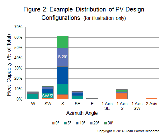
While Figure 2 shows a distribution for large commercial systems, other fleets would look different. For example, the analysis might show that residential and small commercial capacity would not have tracking systems and may have more capacity outside of the south orientation. Furthermore, utility scale systems might have more tracking capacity and more south-facing fixed capacity. In each case, a suitable sample of system designs would form the basis of the modeling effort.
Blend of geographic locations
In addition to variations of azimuth and tilt, system capacity is distributed across a geographical region, and each location has differences in irradiance and temperature, which impact energy production. Without measured data, the easiest method to model energy production of each system would be to use the aforementioned data collected during the incentive or interconnection process to identify the location of each system, and use corresponding irradiance and temperature data, such as SolarAnywhere Typical GHI Year (TGY) data. For example, PowerClerk could be used to identify each system by customer address, from which exact latitude and longitude may be determined.
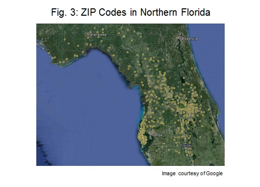
In some cases, the system locations are not known (for example, when estimating future capacity). Here, the geographical distribution must be estimated, and there are a few options. One simplifying method may be to assume that behind-the-meter capacity is located at the centroid of each ZIP code, and the capacity at each location is proportional to ZIP code population. Figure 3 illustrates this method showing each ZIP code in northern Florida. The population of each ZIP code would determine the relative PV capacity located there.
In contrast to customer-sited PV resources, utility-scale resources would not be expected to be located in populated areas. For these fleets, alternative scaling methods could be used, such as the inverse of population or available land.
Putting it all together
Suppose we wanted to model the behavior of large commercial, behind-the-meter PV resources in Northern Florida. A representative fleet could be modeled as a group of systems at each location. We would use the configurations suggested by Figure 2 (represented as 23 separate systems), and locate them at at each ZIP code in Figure 3 (330 locations). This would be a representative fleet of 23 systems x 330 locations = 7,590 systems. The capacity of each system would correspond to weighting factors as described above.
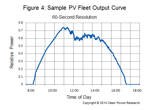
Each system would be modeled and the results summed to give the fleet profile over the modeling period. An example is shown in Figure 4, which shows a fleet modeling result for a single day based on different data, but a similar process.
Coming up…
The above describes some powerful new methods for creating PV fleet profiles, even when information about the fleet is limited. This new capability has a number of interesting applications for utility planning and operations. These include modeling loads in high penetration scenarios (the “duck curve”), and estimating regulation reserves needed to accept PV onto the grid.
Next week we will explain how to use these concepts in combination with “High Frequency” data (satellite-based solar data with time resolution down to 60 seconds), and how this can help utility planners.